先看一看最终效果图:
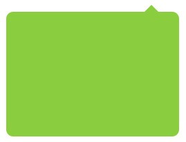
上面图片中,气泡实现关键点就是右上角的三角形。在传统实现中,直接一个三角形图片就可以搞定了;下面将介绍怎样通过纯 CSS 样式代码实现。
要实现上面的三角形图形,需要借助 CSS 中的边框。看看下面边框效果图:
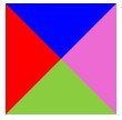
上图中,我们设置 <div> 元素的宽度和高度均为 0px,然后设置边框宽度为 50px,将边框每个边设置成不同的颜色,更容易辨识。代码如下:
<div class="app_icon"></div>
<style type="text/css">
    .app_icon {
        width:0px;height:0px;margin:20px;
        border:solid 50px transparent;
        border-left-color: red;
        border-right-color: green;
        border-top-color: yellow;
        border-bottom-color: blue;
    }
</style>
假如,此时我们将上面图中的图形缩小放到某个 <div> 元素的顶部,效果如下图:
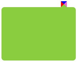
css广告位
代码如下:
<div class="app"></div>
<style type="text/css">
    .app {
        width:250px;height:180px;background:yellowgreen;
        margin:30px; position: relative; border-radius: 10px;
    }
    .app::after {
        position: absolute;
        content: "";
        display: inline-block;
        border: 10px solid transparent;
        border-bottom-color: yellowgreen;
        border-left-color: red;
        border-right-color: orchid;
        border-top-color: blue;
        top: -20px;
        right: 30px;
    }
</style>
然后分别将左、右、上的边框背景颜色设置为透明,气泡效果就实现了。完整代码如下:
<div class="app"></div>
<style type="text/css">
    .app {
        width:250px;height:180px;background:yellowgreen;
        margin:30px; position: relative; border-radius: 10px;
    }
    .app::after {
        position: absolute;
        content: "";
        display: inline-block;
        border: 10px solid transparent;
        border-bottom-color: yellowgreen;
        top: -20px;
        right: 30px;
    }
</style>


 川公网安备51010802032098