这一章的目标
图表比数字直观得多。当训练 Loss 下降趋缓、或者测试准确率突然走平,从曲线上一眼就能发现。
画训练曲线
静态曲线(训练结束后一次画出)
最简单的做法:训练时把每轮的 Loss 和 Acc 记下来,训练完再画。
import matplotlib.pyplot as plt

def plot_training_curves(history, save_path=None):
    """画出训练过程中的损失和准确率曲线"""
    epochs = range(1, len(history['train_loss']) + 1)

    fig, (ax1, ax2) = plt.subplots(1, 2, figsize=(12, 4))

    # 左图:Loss 曲线
    ax1.plot(epochs, history['train_loss'], 'b-o', label='训练集 Loss', markersize=4)
    ax1.plot(epochs, history['test_loss'], 'r-s', label='测试集 Loss', markersize=4)
    ax1.set_xlabel('Epoch')
    ax1.set_ylabel('Loss')
    ax1.set_title('损失(Loss)下降曲线')
    ax1.legend()
    ax1.grid(True, alpha=0.3)

    # 右图:准确率曲线
    ax2.plot(epochs, history['train_acc'], 'b-o', label='训练集准确率', markersize=4)
    ax2.plot(epochs, history['test_acc'], 'r-s', label='测试集准确率', markersize=4)
    ax2.set_xlabel('Epoch')
    ax2.set_ylabel('准确率 (%)')
    ax2.set_title('准确率(Accuracy)变化曲线')
    ax2.legend()
    ax2.grid(True, alpha=0.3)

    plt.tight_layout()
    if save_path:
        plt.savefig(save_path, dpi=150)
        print(f"曲线图已保存:{save_path}")
    plt.show()
怎么读这两张图
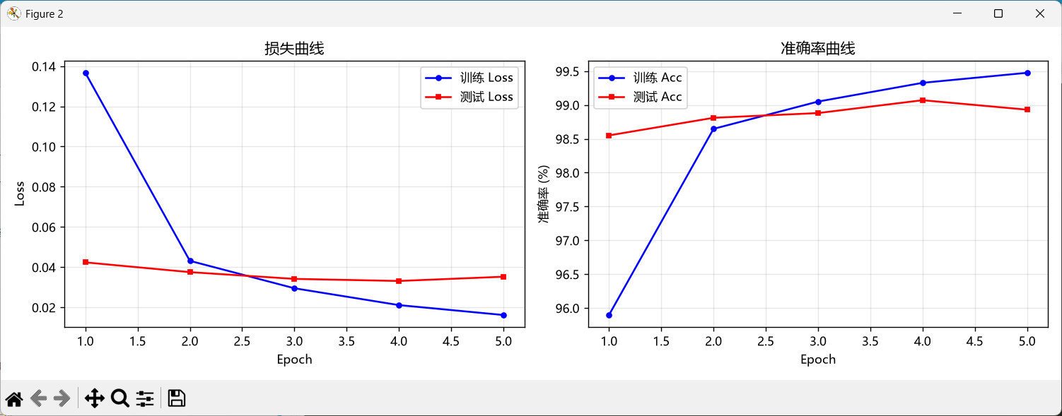
Loss(损失)曲线:
准确率曲线:
动态刷新(训练时实时更新)
这个更有意思 —— 训练过程中图表会实时更新,你能亲眼看着曲线一点一点画出来。
def setup_dynamic_plot():
    """初始化动态图表,返回 fig 和两个 axes"""
    plt.ion()  # 开启交互模式
    fig, (ax1, ax2) = plt.subplots(1, 2, figsize=(12, 4))
    return fig, ax1, ax2

def update_dynamic_plot(fig, ax1, ax2, history, epoch):
    """每轮更新图表"""
    epochs = range(1, epoch + 1)

    ax1.clear()
    ax1.plot(epochs, history['train_loss'], 'b-o', label='训练 Loss', markersize=4)
    ax1.plot(epochs, history['test_loss'], 'r-s', label='测试 Loss', markersize=4)
    ax1.set_xlabel('Epoch')
    ax1.set_ylabel('Loss')
    ax1.set_title(f'损失曲线(第 {epoch} 轮)')
    ax1.legend()
    ax1.grid(True, alpha=0.3)

    ax2.clear()
    ax2.plot(epochs, history['train_acc'], 'b-o', label='训练 Acc', markersize=4)
    ax2.plot(epochs, history['test_acc'], 'r-s', label='测试 Acc', markersize=4)
    ax2.set_xlabel('Epoch')
    ax2.set_ylabel('准确率 (%)')
    ax2.set_title(f'准确率曲线(第 {epoch} 轮)')
    ax2.legend()
    ax2.grid(True, alpha=0.3)

    plt.tight_layout()
    plt.pause(0.1)  # 暂停 0.1 秒让图表刷新
训练循环中加入:
fig, ax1, ax2 = setup_dynamic_plot()

for epoch in range(num_epochs):
    train_loss, train_acc = train_one_epoch(...)
    test_loss, test_acc = evaluate(...)

    history['train_loss'].append(train_loss)
    ...

    update_dynamic_plot(fig, ax1, ax2, history, epoch + 1)

plt.ioff()  # 关闭交互模式
plt.show()  # 保持窗口不消失
💡 动态图不弹窗?
Windows 上如果弹不出来,试试在代码开头加 import matplotlib; matplotlib.use('TkAgg')。
如果是在服务器(无 GUI)上跑,只能用静态模式(保存图片)。
混淆矩阵热力图
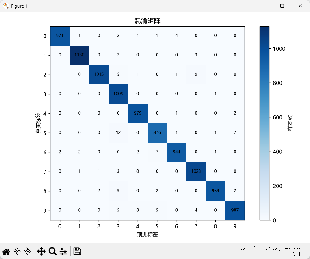
数字表格不够直观,把它画成热力图:
def plot_confusion_matrix(cm, save_path=None):
    """画混淆矩阵热力图"""
    plt.figure(figsize=(8, 6))
    plt.imshow(cm, cmap='Blues', interpolation='nearest')
    plt.colorbar(label='样本数')
    plt.xlabel('预测标签')
    plt.ylabel('真实标签')
    plt.title('混淆矩阵')

    # 在每个格子里写上数字
    for i in range(10):
        for j in range(10):
            color = 'white' if cm[i][j] > cm.max() / 2 else 'black'
            plt.text(j, i, str(cm[i][j]),
                     ha='center', va='center', color=color, fontsize=8)

    plt.xticks(range(10))
    plt.yticks(range(10))
    plt.tight_layout()

    if save_path:
        plt.savefig(save_path, dpi=150)
    plt.show()
热力图里颜色越深、数字越大的格子代表那里样本越多。对角线越亮越好(预测正确),非对角线的亮色块就是模型的弱点。
展示模型识别错误的样本
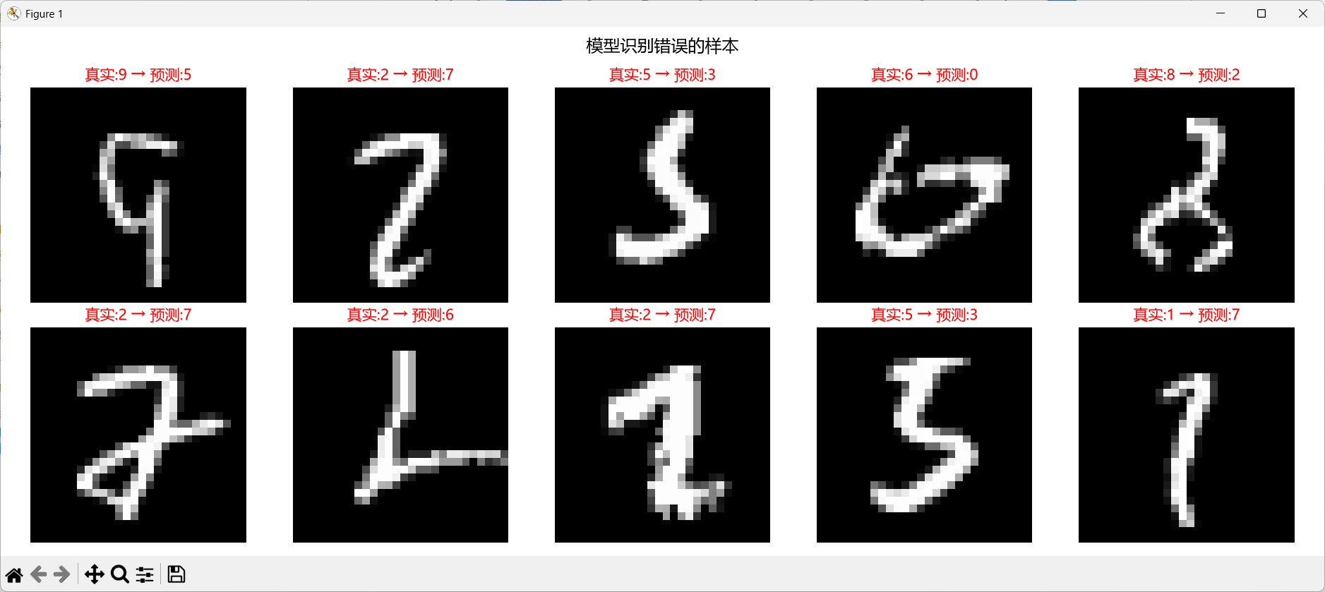
光看数字不直观,不如把模型翻车的图片展示出来:
def show_misclassified(model, test_loader, max_show=10, save_path=None):
    """找出模型识别错误的样本并展示"""
    model.eval()
    misclassified = []

    with torch.no_grad():
        for images, labels in test_loader:
            outputs = model(images)
            preds = outputs.argmax(dim=1)

            # 找出预测错误的样本
            mask = ~preds.eq(labels)
            if mask.any():
                wrong_indices = mask.nonzero(as_tuple=False).squeeze(1)
                for idx in wrong_indices:
                    if len(misclassified) < max_show:
                        misclassified.append((
                            images[idx].squeeze(),
                            labels[idx].item(),
                            preds[idx].item()
                        ))

            if len(misclassified) >= max_show:
                break

    # 画出来
    n = len(misclassified)
    if n == 0:
        print("没有错误样本!模型太厉害了")
        return

    cols = min(5, n)
    rows = (n + cols - 1) // cols
    fig, axes = plt.subplots(rows, cols, figsize=(cols * 3, rows * 3))
    axes = axes.flatten() if n > 1 else [axes]

    for i, (img, true_label, pred_label) in enumerate(misclassified):
        # 反归一化以便显示(近似还原到 [0,1] 范围)
        img_display = img * 0.3081 + 0.1307
        img_display = torch.clamp(img_display, 0, 1)

        axes[i].imshow(img_display, cmap='gray')
        axes[i].set_title(f'真实:{true_label} → 预测:{pred_label}',
                         color='red', fontsize=10)
        axes[i].axis('off')

    for i in range(n, len(axes)):
        axes[i].axis('off')

    plt.suptitle('模型识别错误的样本', fontsize=14, y=1.02)
    plt.tight_layout()

    if save_path:
        plt.savefig(save_path, dpi=150, bbox_inches='tight')
    plt.show()
看到这些翻车样本,你就能理解模型到底在什么情况下会犯错。比如有些手写体确实写得很潦草,人也未必能认出来。
本章小结
训练曲线(Loss + Accuracy)是判断模型学习状况最重要的工具
两条线对比(训练 vs 测试)是发现过拟合的关键手段
混淆矩阵热力图让你一眼看出模型在哪些类别上容易混淆
错误样本展示能帮你理解模型的弱点在哪里
点击查看完整的 实时训练曲线 + 混淆矩阵 + 错误样本 示例代码。


 川公网安备51010802032098