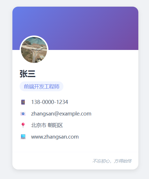
利用 HTML + CSS 实现个人信息卡片,效果如下图:
实现思路
用 HTML 搭建卡片的基础结构,保证语义化(使用 <div> 做容器、<h2> 做标题、<p> 做文本、<ul>/<li> 做信息列表),让结构清晰易读。
用 CSS 进行美化,效果包括:卡片圆角、阴影、内边距、文字排版、颜色搭配、布局对齐等。注意:CSS 相关知识将在 CSS 教程 进行详细介绍。
填充卡片内容,卡片信息包含姓名、职业、个人联系方式、邮箱地址、个人网站等。
具体实现
示例:
<!DOCTYPE html>
<html lang="zh-CN">
<head>
    <meta charset="UTF-8">
    <meta name="viewport" content="width=device-width, initial-scale=1.0">
    <title>我的个人信息卡</title>
    <style>
        * {
            margin: 0;
            padding: 0;
            box-sizing: border-box;
            font-family: "Microsoft YaHei", sans-serif;
        }

        body {
            background-color: #f0f2f5;
            display: flex;
            justify-content: center;
            align-items: center;
            min-height: 100vh; /* 占满整个视口高度 */
        }

        /* 个人信息卡核心样式 */
        .personal-card {
            width: 350px; /* 卡片宽度 */
            background-color: #ffffff;
            border-radius: 16px; /* 圆角效果 */
            box-shadow: 0 4px 12px rgba(0, 0, 0, 0.1); /* 阴影提升立体感 */
            overflow: hidden; /* 隐藏超出圆角的内容 */
            transition: box-shadow 0.3s ease; /*  hover 过渡动画 */
        }

        /* 卡片 hover 效果,增强交互感 */
        .personal-card:hover {
            box-shadow: 0 8px 24px rgba(0, 0, 0, 0.15);
        }

        /* 卡片头部(头像+背景图) */
        .card-header {
            width: 100%;
            height: 120px;
            background: linear-gradient(135deg, #667eea 0%, #764ba2 100%); /* 渐变背景 */
            position: relative; /* 用于定位头像 */
        }

        /* 头像样式 */
        .avatar {
            width: 80px;
            height: 80px;
            border-radius: 50%; /* 圆形头像 */
            border: 4px solid #ffffff; /* 白色边框衬托 */
            position: absolute;
            bottom: -40px; /* 向上偏移一半,露出在头部和内容区之间 */
            left: 20px;
            object-fit: cover; /* 保证图片不变形 */
        }

        /* 卡片内容区域 */
        .card-content {
            padding: 50px 20px 20px; /* 顶部预留头像空间 */
        }

        /* 姓名样式 */
        .name {
            font-size: 22px;
            font-weight: bold;
            color: #2d3748;
            margin-bottom: 8px;
        }

        /* 职业/标签样式 */
        .job {
            font-size: 14px;
            color: #667eea;
            margin-bottom: 20px;
            padding: 4px 12px;
            background-color: #f0f4ff;
            display: inline-block;
            border-radius: 16px;
        }

        /* 信息列表样式 */
        .info-list {
            list-style: none;
        }

        /* 单个信息项样式 */
        .info-item {
            display: flex;
            align-items: center;
            font-size: 14px;
            color: #4a5568;
            margin-bottom: 12px;
        }

        /* 信息项图标(用文本替代,无需外部资源) */
        .info-icon {
            width: 20px;
            height: 20px;
            display: flex;
            justify-content: center;
            align-items: center;
            color: #667eea;
            margin-right: 12px;
            font-weight: bold;
        }

        /* 卡片底部样式 */
        .card-footer {
            padding: 16px 20px;
            border-top: 1px solid #f7fafc;
            display: flex;
            justify-content: flex-end;
        }

        /* 签名样式 */
        .signature {
            font-size: 12px;
            color: #a0aec0;
            font-style: italic;
        }
    </style>
</head>
<body>

    <!-- 个人信息卡容器 -->
    <div class="personal-card">
        <!-- 卡片头部(背景+头像) -->
        <div class="card-header">
            <img src="https://picsum.photos/200/200" alt="个人头像" class="avatar">
        </div>
        <!-- 卡片内容 -->
        <div class="card-content">
            <h2 class="name">张三</h2>
            <span class="job">前端开发工程师</span>
            <ul class="info-list">
                <li class="info-item">
                    <span class="info-icon">📱</span>
                    <span>138-0000-1234</span>
                </li>
                <li class="info-item">
                    <span class="info-icon">📧</span>
                    <span>zhangsan@example.com</span>
                </li>
                <li class="info-item">
                    <span class="info-icon">📍</span>
                    <span>北京市 朝阳区</span>
                </li>
                <li class="info-item">
                    <span class="info-icon">💻</span>
                    <span>www.zhangsan.com</span>
                </li>
            </ul>
        </div>
        <!-- 卡片底部 -->
        <div class="card-footer">
            <p class="signature">不忘初心,方得始终</p>
        </div>
    </div>

</body>
</html>
看看效果👉自己动手试一试 »

 川公网安备51010802032098